
The High Cost of Looking Cheap
3 min read

Why a $100 Logo is the Most Expensive Mistake You Can Make
Let me paint a familiar picture. You are launching a new business, or maybe refreshing an old one. You’re watching the budget like a hawk, so you hop online, find a freelancer and pay $100 for a logo.
A few days later, boom! it arrives in your inbox. You slap that shiny new PNG file on the top left corner of your website, paste it onto a VistaPrint business card, and dust off your hands.
"I have a brand!" you declare to the world.
Except... you don’t. You have a graphic. And unfortunately, treating that cheap graphic as the finish line might be the single most expensive mistake you make this year.
Let’s talk about the brutal reality of the "status quo" and the high cost of looking cheap.
Human psychology is ruthless. When a potential customer lands on your website, sees your proposal, or watches your branded vehicle drive by, they make a snap judgment about your credibility in a fraction of a second. If your visual presence looks like a weekend DIY project, they will subconsciously assume your actual services reflect that same amateur level of effort.
When you look cheap, you are forcing yourself to compete purely on price. You become a commodity. But when you look premium, you get to compete on value.
Here is where 90% of small businesses completely drop the ball: they think the logo is the entire race. In reality, the logo is just the starting gun.
What happens when you take that $100 logo and pair it with a random, generic font you liked on Microsoft Word? What happens when the blue on your website doesn't match the blue on your fleet vehicles, and your social media posts use completely different graphics every Tuesday?
It creates visual chaos. It creates friction. And to a buyer, friction feels like risk.
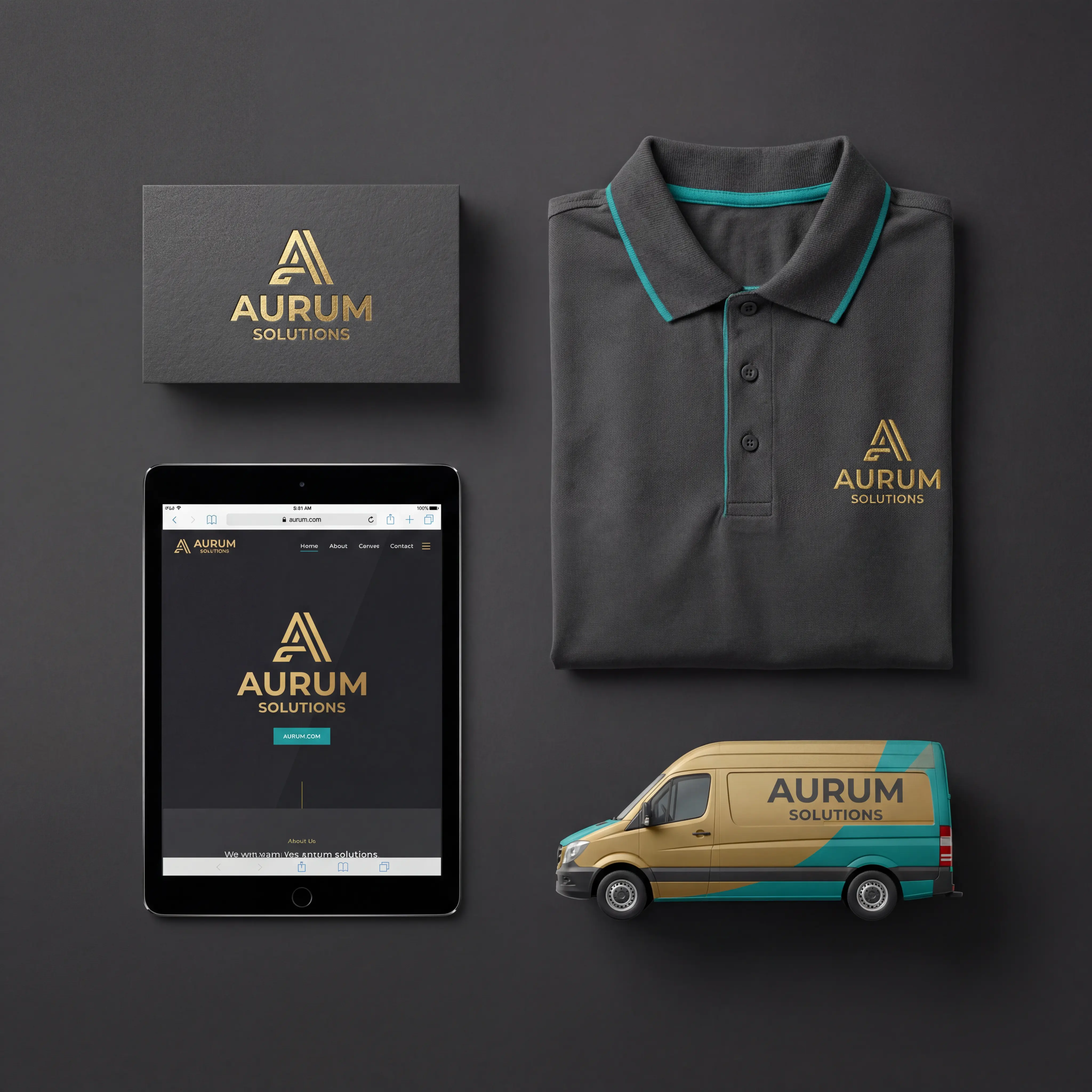
Developing a true visual brand means building an entire ecosystem around that logo. It requires a cohesive color palette that evokes the right emotion. It means selecting specific typography that communicates authority. It means establishing strict style guidelines so that whether a customer is looking at your Instagram Reel, your printed brochure, or your indoor TV display, the experience is instantly recognizable and undeniably professional. It is the difference between showing up to a sales pitch in a tailored suit versus a mismatched tuxedo t-shirt.
(Now, before the marketing purists jump into the comments: yes, a "Brand" is much more than just visuals. It is your company culture, your customer service, the way your team answers the phone, and your core values. But let’s put a pin in that. We will dive into the deep end of organizational brand culture in another episode. Today, we are strictly talking about your visual storefront.)
Takeaway
You can’t fully control how people see you — but you can influence that perception with intent, clarity, and psychology. A strong personal brand isn’t built overnight, but through conscious, consistent choices. When you understand the human mind — how people process, judge, and remember — you build a brand that doesn’t just exist, it resonates. And that’s where the real power lies: not in looking polished, but in being deeply, recognizably you.
Call us today for a free consultation.


